Tape 176: The Evolution Of Poster Design
I’ve spent the last few weeks, on and off, working with various incredible brains (art director Miranda Holms, photographer Oliver Holms, designer Will Andrews, producer Queenie Miller) developing and constructing the poster design for my new show (it’s called You Wait. Time Passes. and it’s coming to a wonderful comedy festival near you at some point in the next few months, have I mentioned that?) I’m so excited by how it’s all been coming together, and it’s the most strategic and collaborative I’ve ever been on the poster front. This week, I thought I’d take a look back at my posters from Fringes past and see what I’ve learned.
The big thing we wanted to avoid with the poster for this show was anything close to the ubiquitous “Picture of the comedian doing a funny pose/face in front of a colourama,” because that trope really does very little for me. I often find in Edinburgh that there are so many posters that look like that that they all effectively become invisible to me – I don’t even see them, I move through them like a fish through water (very easily and unthinkingly, for readers unfamiliar with the habits of fish). The ones I notice are the ones that intentionally do something slightly surprising, whatever that may be.
We thought that if we went for something more conceptual that was shot on location and built around a genuinely beautifully shot and interestingly composed portrait, then it would actually stand out much more among the more traditional posters around it. We also wanted the portrait itself to nod towards the show’s concept so that people didn’t think it was a simple stand-up show, but something with a character and a narrative to it, exploring ideas of wasting time, missing out on life, etc etc.
Everyone’s done such an amazing job on steering that towards completion – from Miranda’s initial concept and reference images, to Ollie’s amazing portraits, to Will’s beautiful design elements, to Queenie’s brilliant shepherding of the whole process. All of it is coming together to make me feel very proud of how much I’ve been able to actively engage with the idea of what will make for an eye-catching, standout poster that sells the concept and tone of the show.
I’ve talked often in the past about how I initially engaged with the Fringe in a way that was hopelessly naive, with absolutely no idea what it was or how it functioned. In some ways, I miss the days when it was possible to do that – to just go up there with a show and very little in the way of expectations or preparations, and to completely transform yourself as a performer through the sheer experience of doing it. That’s not very easy to do any more, and these days I recognise that the poster is a massively important tool in actually communicating to your audience what it is you’re doing there. But I’ve dug out my old flyers and had a good laugh at how I can chart my own naivety over the years, and the ways in which it slowly transformed. So here is my 12-year crash course in how to get better at understanding marketing at the Fringe:
(A brief caveat – I am going to be heavily critical of many of my earlier posters, even the ones where I did get help from amazing photographers and designers. Their work was always exemplary and they did exactly what I asked for to a really good standard. The problems I am going to point out are entirely down to what I was trying to do in the concept stages, rather than down to anything anyone else brought to the process):
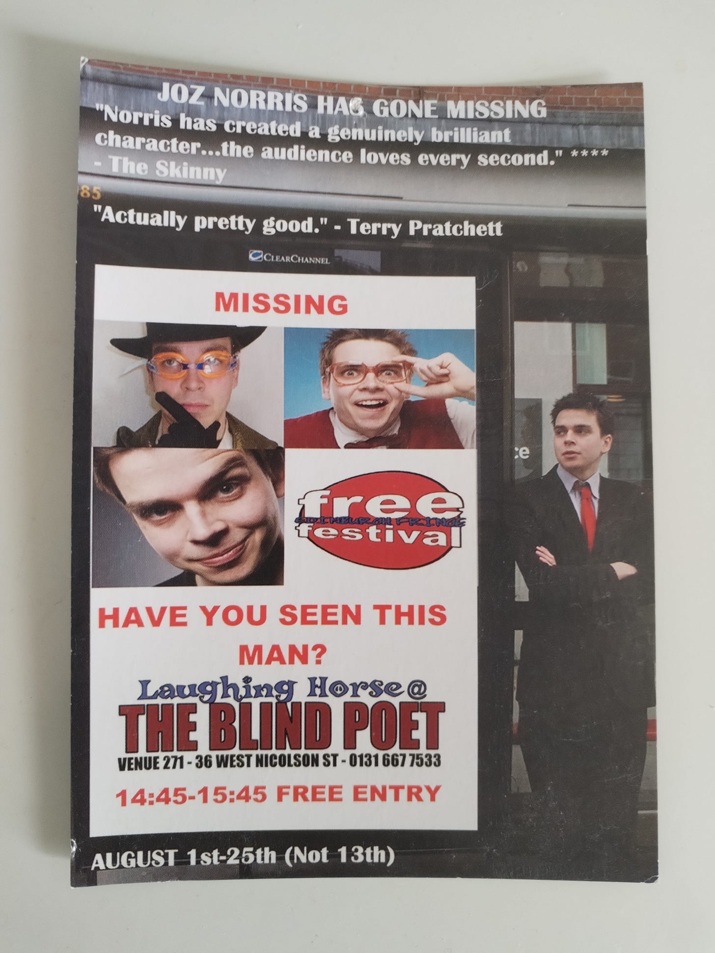
Joz Norris Has Gone Missing, 2013 – It won’t surprise you to know that this is one of the ones where I did not collaborate with a professional designer. This is one of the worst posters I’ve ever seen in my life. I made it on Paint on a dying laptop that struggled to run Paint. Everything about it is baffling. The idea that I’m standing next to a bus stop that has a missing person poster looking for my own wacky characters does not come across in the slightest. It looks more like I had four photos of myself, couldn’t decide which one I liked so just put them together in the ugliest arrangement known to man. Also, one of the characters is just me raising my eyebrow. The Skinny quote is admittedly nice, but it certainly doesn’t LOOK like I’ve created a genuinely brilliant character. It looks like I have, among other things, put a hat and some goggles on and decided that was good enough. I clearly didn’t know how to do stars, so just did asterisks, which makes it look like the Skinny called me a c**t. I don’t know why the Free Festival logo is one of the biggest things on the poster, and I was clearly really worried about people knowing what the venue was called. Also, some people thought this was a genuine missing person poster and got really confused by it. All in all, a truly disastrous effort.

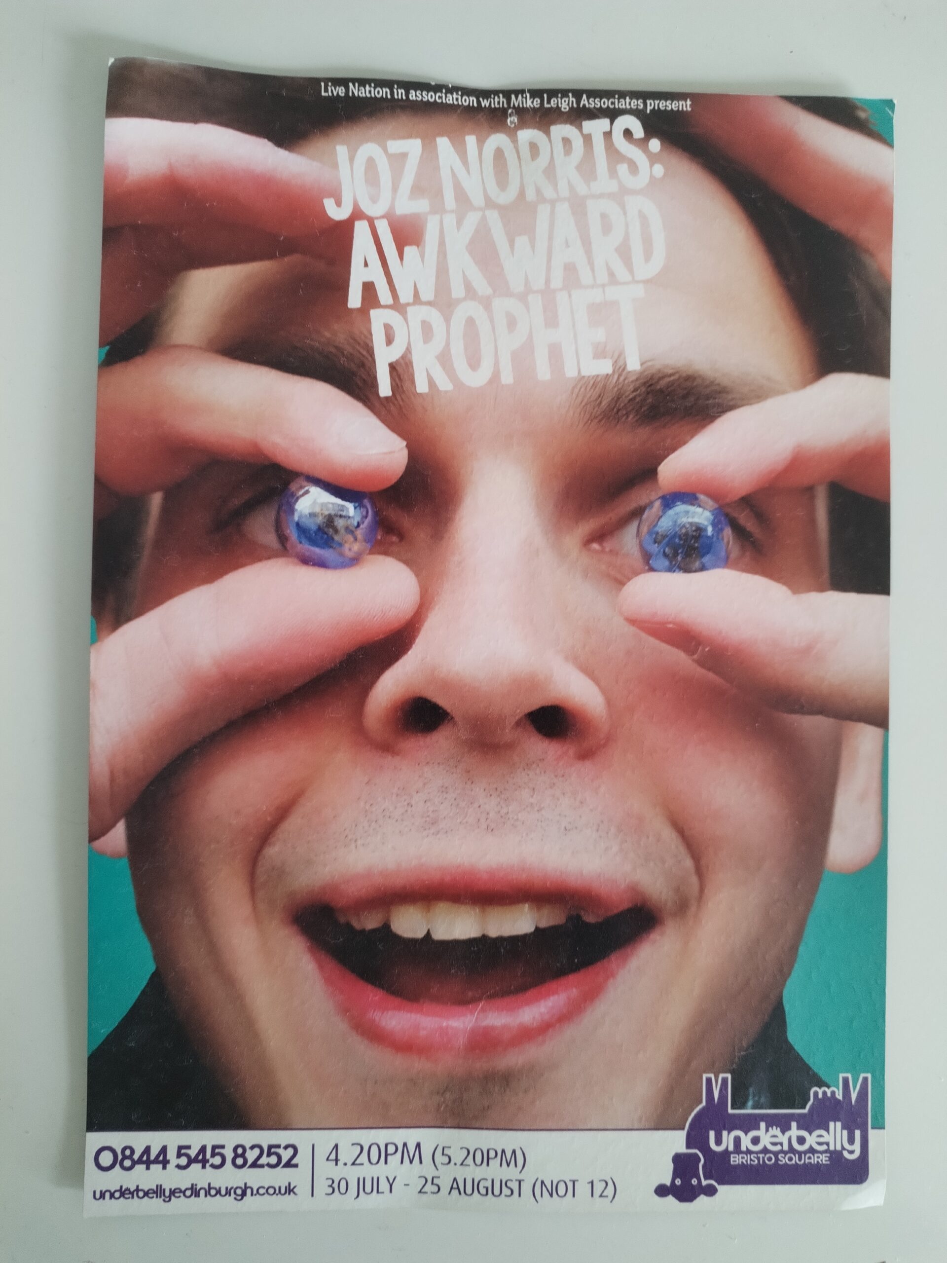
Awkward Prophet, 2014 – I actually don’t hate this. The “Face is too big for poster” gag was also recently used for Stevie Martin’s brilliant clout (albeit executed much better), and it is kind of impactful. The marbles idea was a homage to the Marillion album Marbles, which is a reference that was completely irrelevant to the show and which precisely nobody picked up on. I wrote to them asking if they were ok with me homaging it, but they never replied. I guess they were busy. The total lack of quotes or accolades is a bold choice for a completely unknown act, but a potentially interesting one that results in a clean-looking poster. It might have been smarter if the title had been something more interesting, funny or that clearly sold the concept of the show in some way, rather than just being two words I’d lifted from a poem. Also, this is the first in a series of posters where the main message I seemed to want to communicate to the viewer was “I’m a crazy guy.” Overall, an interesting idea, but a little fumbled in execution.
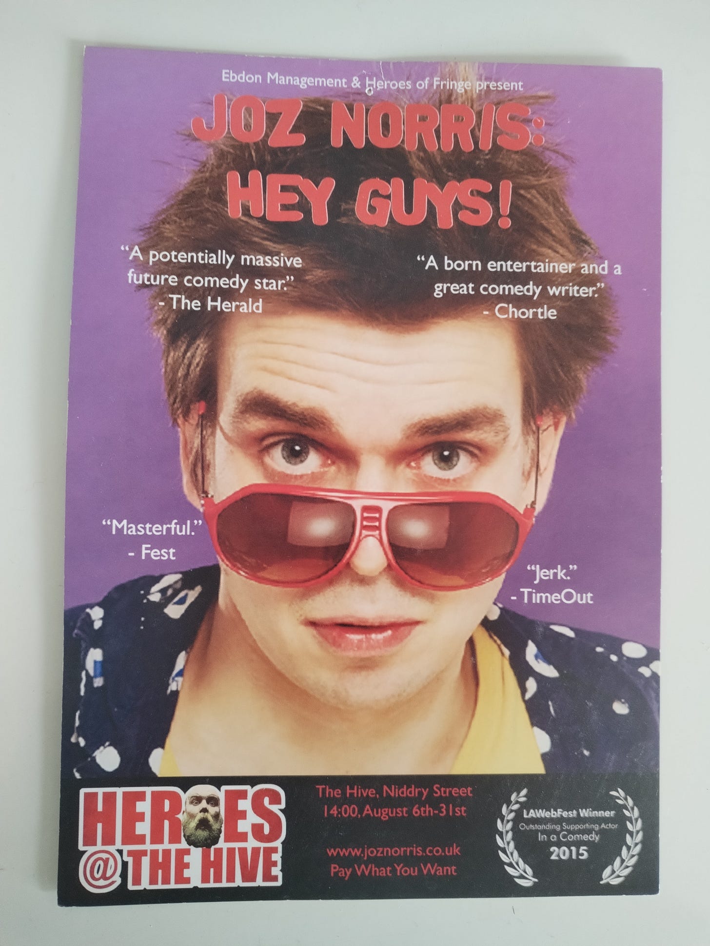
Hey Guys! 2015 – Did somebody say “Comedian looking silly in front of a colourama?” This is number 2 in the “I’m a crazy guy” series. I wanted to use a photo that made me look silly, although in hindsight this picture makes me look quite annoying, kind of like a character you might find in an American Pie movie. I like the font and layout of the title. It’s frustrating that “Masterful” and “Jerk” are not in parallel. I like the idea that anyone would’ve been on the fence about this show and then decided to go for it after reading that I won Outstanding Supporting Actor in a Comedy at LA WebFest 2015. I have no idea why the picture is so pixellated when it was taken by a professional photographer in a studio. This is certainly something I did wrong in the design phase rather than anything the photographer did, the photographer was very good. All in all, this is completely fine. It’s quite an irritating poster, but it was also quite an irritating show.
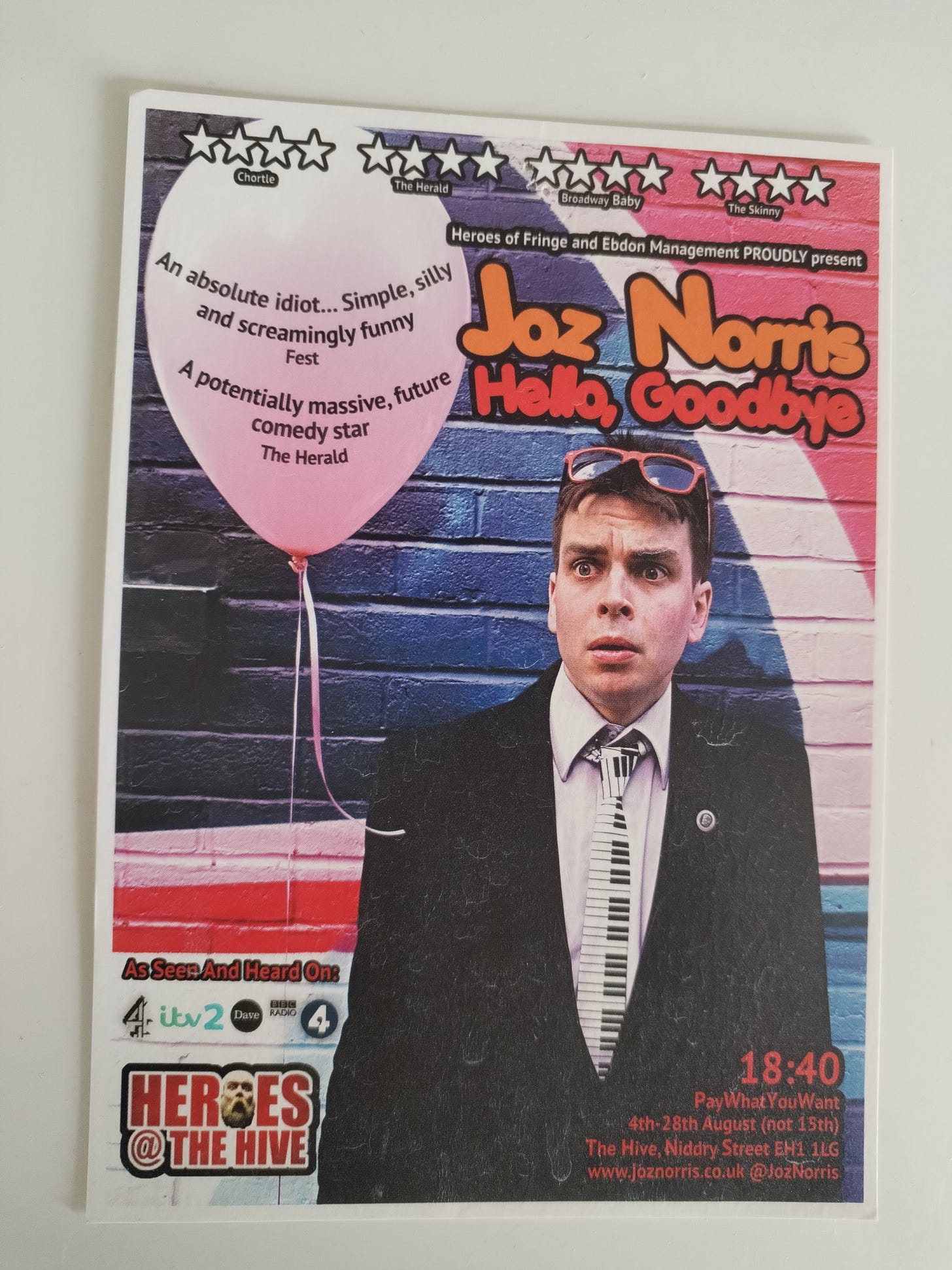
Hello, Goodbye, 2016 – In which I replicate the previous year’s facial expression almost exactly but change the elements around it. This show was about love and death, specifically the death of my grandad and the year when I met my girlfriend at the time. The concept was that I was dressed for a funeral but holding a balloon that I had styled to look like my girlfriend’s head. This wasn’t a particularly good concept even in theory, but in practice, the wig wouldn’t stay on the balloon, so instead the poster is just me in a black suit holding a balloon. Why I have decided to shoot it in front of a colourful brick wall instead of a different location that more clearly suggests “I have come to my grandad’s funeral carrying a balloon that looks like my girlfriend’s head” I’m not sure. This is the third “I’m a crazy guy” poster in a row, although the edge is taken off it ever so slightly by my comparatively sombre attire. Also, I look exactly like Pob.
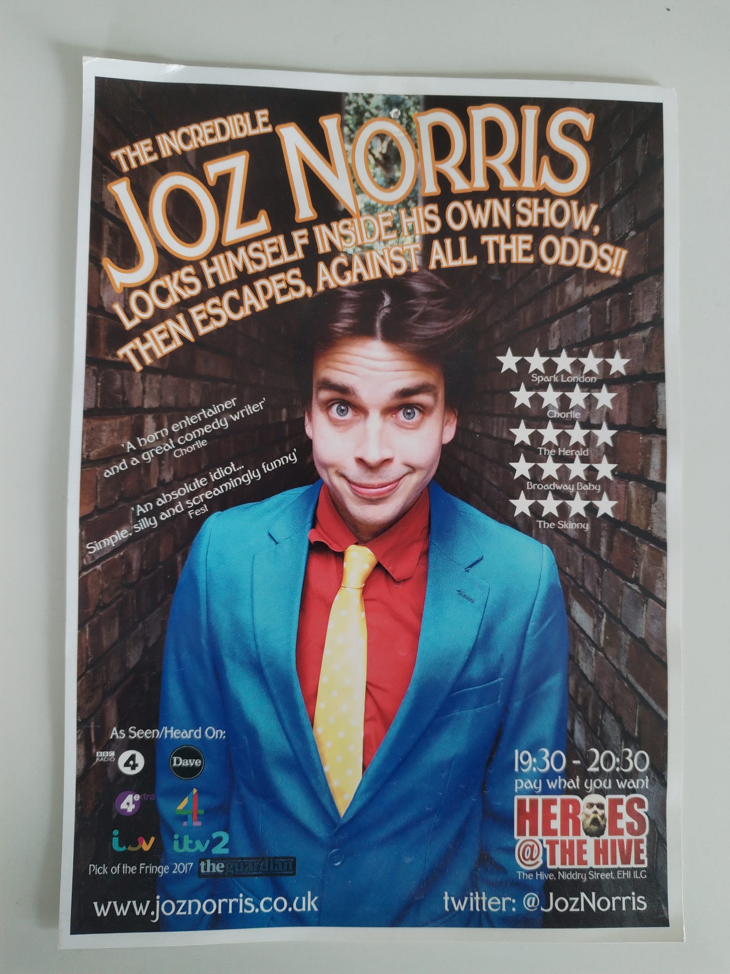
The Incredible Joz Norris… 2017 – Without a doubt my best poster up to this point. I like the “olden days spectacular” vibes of the title. I like the composition of the image between the two walls, and the way it nods towards themes of imprisonment and entrapment. After a comparatively sombre year, “I’m a crazy guy” comes back with a vengeance via the most disgusting outfit and earnestly kooky expression yet. Looking back, I am shocked by how many years I seemed to insist on trying to say nothing about myself other than “I’m crazy, like a Medieval jester or something,” which is neither interesting nor true. These days I’m much more at peace with just being quite an ordinary person, but I clearly spent the best part of five years frantically wrestling with that. Anyway, this is a decent poster.
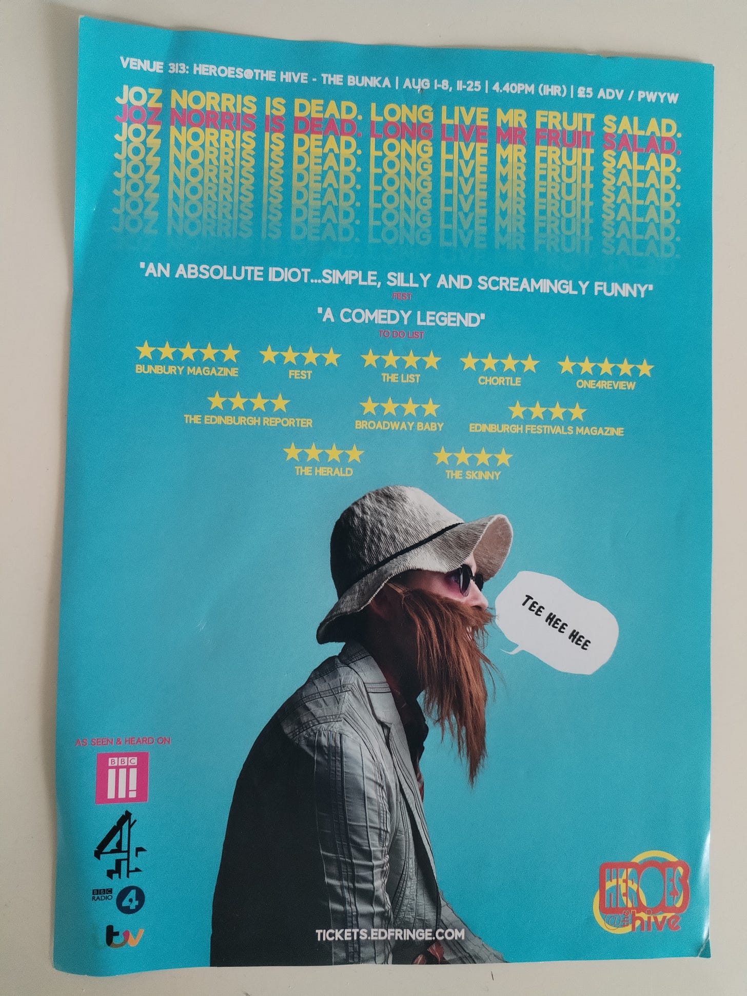
Joz Norris Is Dead. Long Live Mr Fruit Salad. 2019 – This is my first poster where it actually looks like I’ve made a show, rather than just making a vehicle for myself as some sort of wacky personality. By and large, though all the previous shows had elements I was proud of, that’s also true. I like this poster. The colours are eye-catching, it looks like there’s some idea or point or concept to the show, and I love the mischief of the “Tee hee hee” speech bubble. In hindsight, because Mr Fruit Salad was such a visual concept, I wonder if I’d have been better off choosing a different photo of him that sold the visuals a little better than this profile shot does, although I also like the sense that you can’t quite see him, and you can sort of see me underneath him.
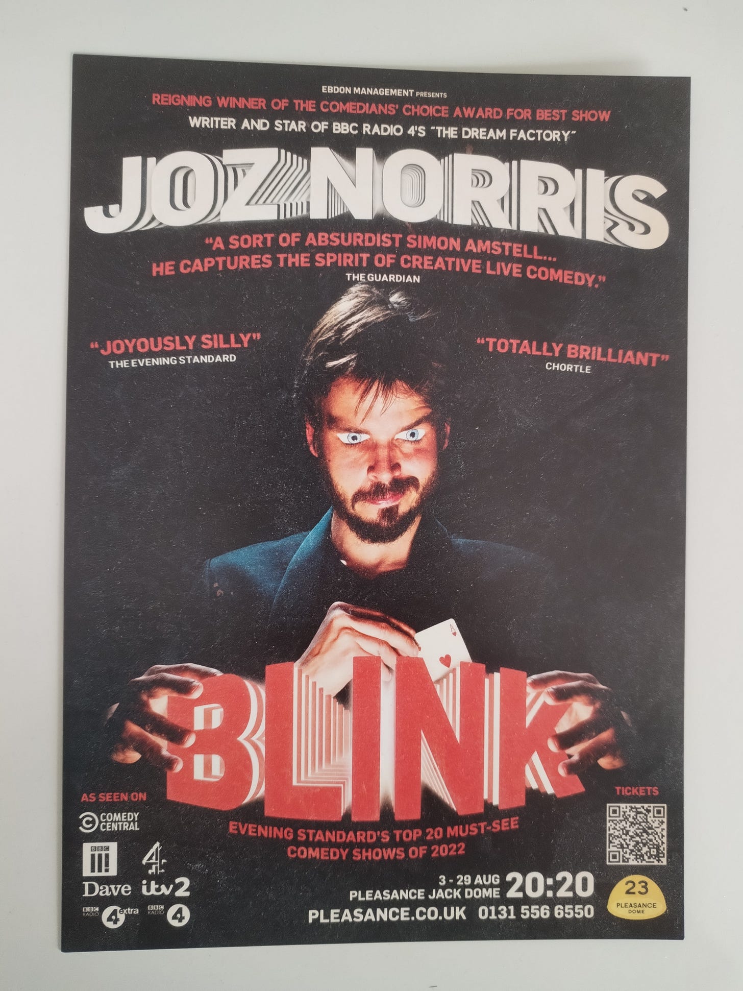
Blink, 2022 – This is not to minimise the impact of anyone I collaborated with before 2020, or anyone I’ve collaborated with since, but the big thing that changed in 2020 was that I met Miranda Holms and Miranda has an amazing eye for design, and refuses to ever let me settle for “Good enough.” In going through these old flyers, I was appalled to find that the blurb written on the back of the flyer for Hey Guys! literally reads “This’ll do, I reckon. Nice big picture of my face, lovely bright colours. What more do you want?” which is very much emblematic of my old approach to design (and, in a way, doing comedy full-stop). The poster for Blink is night and day compared to my old posters, and a lot of that is down to Miranda’s design concept and art direction. The rest is down to designer extraordinaire Sam Nicoresti, who did such a good job of evoking the iconography and mood of sleek showbiz magic. We actually ended up having some audience members coming in who thought it was a magic show, and were surprised it was a comedy. I thought the third hand and multiple quotes about comedy were enough to clarify the genre, but perhaps if I did it again I’d find one extra way to sneak some additional silliness into the poster, but even still, I absolutely love this poster.
It’s so odd that putting these posters back to back, I can see the exact trajectory of my own creative development also reflected in the images. I can see myself going from someone who didn’t know what he was doing and was too scared to ask for help, turning into someone who settled into a pattern that was comfortable and fun but struggled to say anything of real substance, eventually becoming someone who made purposeful, intentional shows with an idea or a concept at the heart of them and who consciously tried to push the craft and effort level of those shows. I had no idea that the posters I was making weren’t just promotional images to help sell a product, but were expressions of who I was at the time. I understand that much better these days, and I’m much more mindful of trying to craft something that really does what I want it to, without squandering the work of very talented people, or squandering the attention of people who will end up looking at it.
For fellow comedians or artists reading this, I’d love to know how your own past promotional materials reflect who you were at the time, and whether looking back at them enables you to chart your own progress in the same way. Some comedians come straight out of the gate less fearful and stubborn than I was, and already well aware that you have to collaborate with talented people in order to produce good work, so some others may be able to look back on a series of posters that were beautiful and intentional and well-made right from the off. Or perhaps there are others like me who can literally see the things they believe in and the way they go about making stuff evolving visually before their eyes? I’d love to hear any thoughts this prompted for any of you, and see some other old posters or flyers if anybody has anything to share!
For those of you who aren’t in the business of making promo art for stuff themselves, then I hope this simply served as a useful primer in what looks good, what works well, and how to gradually get to a place of half-competence from even the most alarmingly bad of beginnings. If you’ve never tried to make any promotional art yourself, why not give it a go? You can’t do any worse than I did when I first did it.
A Quick Plug – This weekend I’m in Edinburgh doing a WIP of You Wait. Time Passes. at the amazing Monkey Barrel – if you’re in or near Edinburgh, do come on down, I’d love to get a nice crowd along for it!
A Cool New Thing In Comedy – If you’ve not seen it yet, check out Last One Laughing on Amazon Prime, it’s the best new UK comedy format show in ages, I think. I’m particularly enjoying watching my dear pal Harriet Kemsley go into terrifying robot mode in an impressive effort to not laugh at Bob Mortimer. Really enjoying it so far.
What’s Made Me Laugh The Most – Speaking of Harriet, the thing that made me laugh the most was recording an episode of Pappy’s Flatshare Slamdown, in which we both managed to completely misunderstand the premise of various rounds to almost catastrophic extremes, and came to the conclusion that we might just be the same person. I cried laughing at some of her efforts to get things back on track.
Book Of The Week – I’ve nearly finished The Ministry Of Time by Kaliane Bradley, which is a sort of sci-fi time travel romance. I really like a lot of what it has to say about the concept of cultural assimilation and the way we other people. Sometimes it pivots from grounded romance into sci-fi thriller a bit too randomly for me, but it’s been a really fun read.
Album Of The Week – Allegria by Gipsy Kings. Remember when I started getting into Gipsy Kings? Well I’m back on them, this time with their debut. These guys just came right out swinging! It’s the most assured debut of 1983, surely! They rock and I love them.
Film Of The Week – Flow. This is lovely. It’s about a cat who’s trying to survive in a flooded, post-human Earth. It was all made using Blender, so the animation style has a very strange look to it – the environments are incredibly beautiful but the animals are quite flat and painterly. I thought it might look cheap, but the combination is actually really characterful. Try to catch it if you can, it’s brilliant.
That’s all for this week! As ever, let me know what you thought, and if you enjoy the newsletter enough to send it to a friend or encourage others to subscribe, I’d really appreciate it. Take care of yourselves until next time,
Joz xx
PS If you value the Therapy Tapes and enjoy what they do, and want to support my work and enable me to keep writing and creating, you can make a one-off donation to my Ko-Fi account, and it’s very gratefully appreciated.
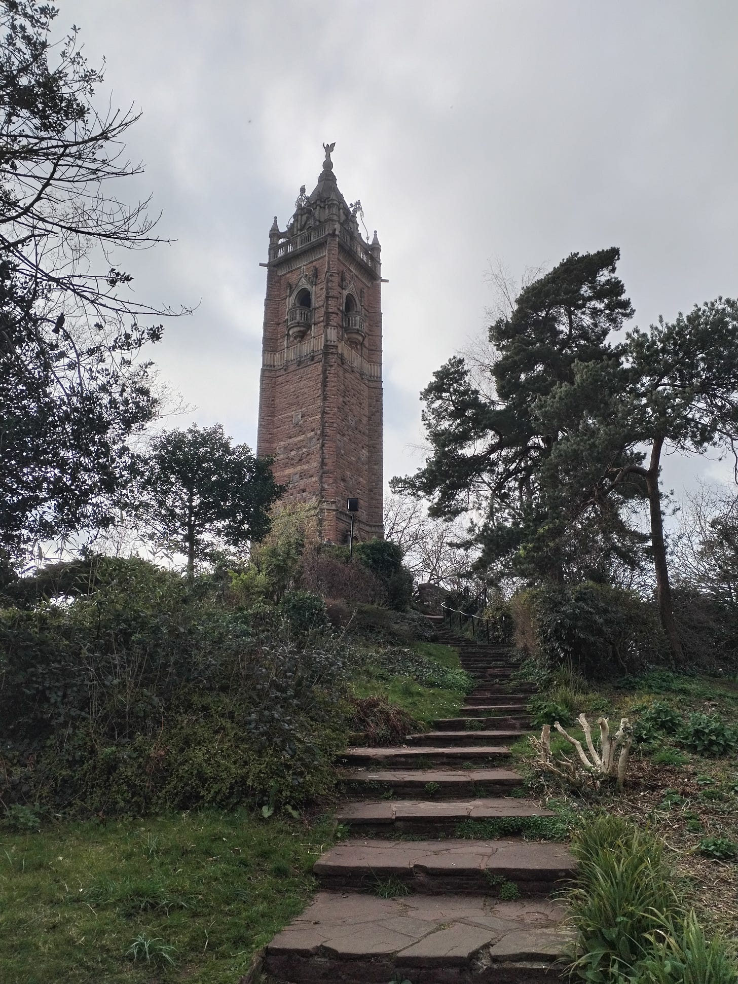
PPS Had a lovely preview in Bristol this week and climbed this lovely big tower. Thanks to all who came to the show:
